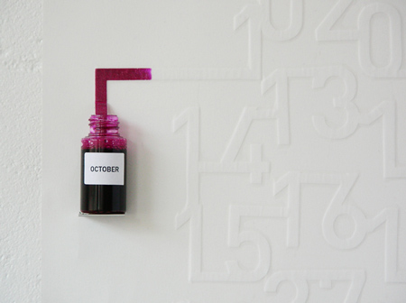
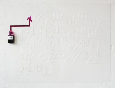
I don’t normally re-blog other stuff I find online, because it seems a bit… well… lacking in originality. BUT I had to with this one, because it’s all the right kinds of awesome. I spotted Oscar Diaz’s Ink Calendar over at Trend Land and completely fell in love with the notion.
Oscar Diaz is a product designer based in London. Rather than explain his ink calendar creation myself, I’ll let the artist do the talking:
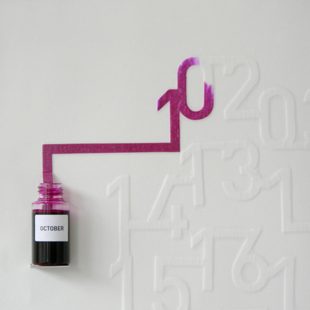
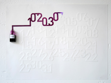
“Ink Calendar” make use the timed pace of the ink spreading on the paper to indicate time.
The ink is absorbed slowly, and the numbers in the calendar are “printed” daily. One a day, they are filled with ink until the end of the month. A calendar self-updated, which enhances the perception of time passing and not only signaling it.
The ink colors are based on a spectrum, which relate to a “color temperature scale”, each month having a color related to our perception of the whether on that month. The colors range from dark blue in December to, three shades of green in spring or oranges, red in the summer.
The scale for measuring the “color temperature” that I have used is a standard called ‘D65’ and corresponds roughly to a midday sun in Western / Northern Europe.
The “Ink Calendar” was developed for “Gradual “, an exhibition featuring works, which were evolving during the exhibition time at the London Design Festival 2007.
Production: Self-production.
Specs: Ink on paper, various dimensions.
Exhibitions: “Gradual” 5, Crownwell Place, London Design Festival, 2007.
And this is what it looks like (images from the original post at Trend Land):


